 Last week I got an “exclusive invitation” to a brand update from Airbnb. The event was held yesterday and was streamed live from the living room of the very first Airbnb.
I consider Airbnb to be one of my favorite travel companies out there. Kim, Lucas and I have used the service a few times in places like Singapore, Italy and most recently- Nebraska. (Check out my review of our first Airbnb stay- Our Awesome Experience with Airbnb.)
The company opens up possibilities of places to stay at reasonable prices when either- we don’t have or want to use points, nice hotels are way to pricey and the cheaper rooms seem pretty bad.
Now back to the exclusive invitation.
The event was being held while I was at work so there was no way that I could tune it. Bummer, but what can you do?
When I got home from work, I had an e-mail from Airbnb with the subject Belong Anywhere.
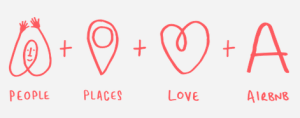
When I opened up the e-mail I saw the interesting yet bizarre graphic shown above, along with the message “Today we’re unveiling a new Airbnb.”
There was now a new look along with a symbol. The e-mail also mentioned that “it’s an expression of what it truly means to belong anywhere.”
I wasn’t really sure what was wrong with Airbnb’s old look and actually liked their logo.

I headed on over to the fancy new site to find out some answers about this new look and funny symbol (shown in the first image of this post).
I scrolled down a bit and came to a video: Introducing the Belo.
Check it out:
I found the message being presented a bit strange and almost cult-ish in some ways. It seems that Airbnb is trying to rebrand themselves as this company that is on a mission.
A mission to spread belonging? Odd. While I have felt pretty welcome, the motivation for our choice of Airbnb came mainly to price and location. We did enjoy conversations with all of our hosts but it wasn’t like we were expecting to make a life-long friend just because we used Airbnb!

This brings me to the Belo. So what exactly is a Belo?
The first thing I saw was an upside down heart or, was I seeing a butt-crack?
I wasn’t alone in not liking or understanding the Belo. I even saw some refer to the Belo as balls. (Not the kind you throw.)
With all of the negative feedback, my guess is that somebody in their marketing department is going to lose their job!
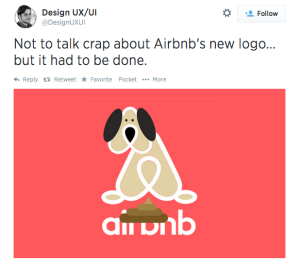
While in the middle of writing this post, I came across an article from Skift which was an interesting read. In it were some Tweets of reactions to the new Airbnb symbol.
I’ll leave you with my favorite:

So what do you think of the new Airbnb?
Get a $25 Airbnb Credit:
If you haven’t tried Airbnb yet and would like to sign up, I’d appreciate if you would use my referral link. You’ll get a $25 Airbnb credit and I will get $25 when you travel and $75 if you decide to host.
Tyler- It is just so strange!
Santastico- Exactly! I always liked the script logo.
As you need a designer to draw that logo. OMG!!!! Looks terrible and the red also does not fit there.
I think it was actually a marketing firm they hired that came up with this. There’s a pretty self-involved series of…articles? posted by DesignStudio, a London and San Francisco based marketing firm that looks like they did a lot of this work. My favorite comment I’ve heard is along the same lines as the ones you’ve mentioned:
“Make fun of the Airbnb logo all you want but some designer was able to make it look like a vagina, boobs, testicles and a butt all at one.”